Spring Refresh: Paint Trends
April 2021
by carolee mccall smith | photos by nathan satran
Spring is here. And you’ve been cooped up inside for over a year now, staring at those wall colors that have turned stale. It’s time for a refresh, and updating your paint is the answer you’ve been looking for. But then you walk into the paint store and see a seemingly endless display full of teeny tiny paint swatches. How in the world do you pick a paint color for a whole room, or your entire house, off of that one tiny swatch? Let’s start by narrowing all those colors down to current trends.
Years and years ago (I don't want to age myself here), warm browns were the reigning kings of the paint world. No beating around the bush; I hated them. Brown is just not my color. Gray is. And when gray hit the scene to de-throne brown, I was thrilled. Alas, I'm sad to say that gray has seen its peak. It was too often paired with gray and more gray and left people feeling cold. (I'll always love you though gray.)
After a decade of middle-of-the-road grays, people are craving something light and airy or dark and dramatic. We want a light place to feel refreshed and a dark escape to recharge.
Let’s start with the light tones. Whites and off-whites are the new kings of the color world. And if you're thinking to yourself, why did she use a plural for white…white is white; I have a world of different whites to show you, my friend.
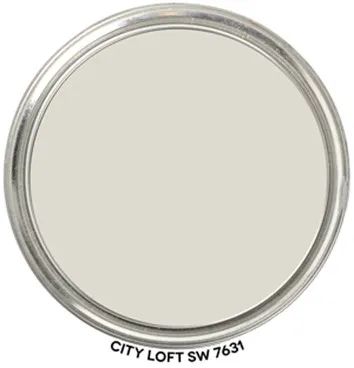
Sherwin Williams City Loft SW 7631 (walls) with Pure White SW 7005 (trim)
With all paint colors, the mass tone is the color family it belongs to (e.g., blue, green, red), and there is the undertone. Whites and grays, in particular, can feel drastically different based on their undertones. You don't necessarily pick up on the undertone right away, but it does impact what the color feels like. When working with whites and grays, look at the color in different lighting types to see how the undertone interacts with the light and your surroundings. As soon as that color is all around you, what was once just a blue hue can quickly become over-the-top powder blue.
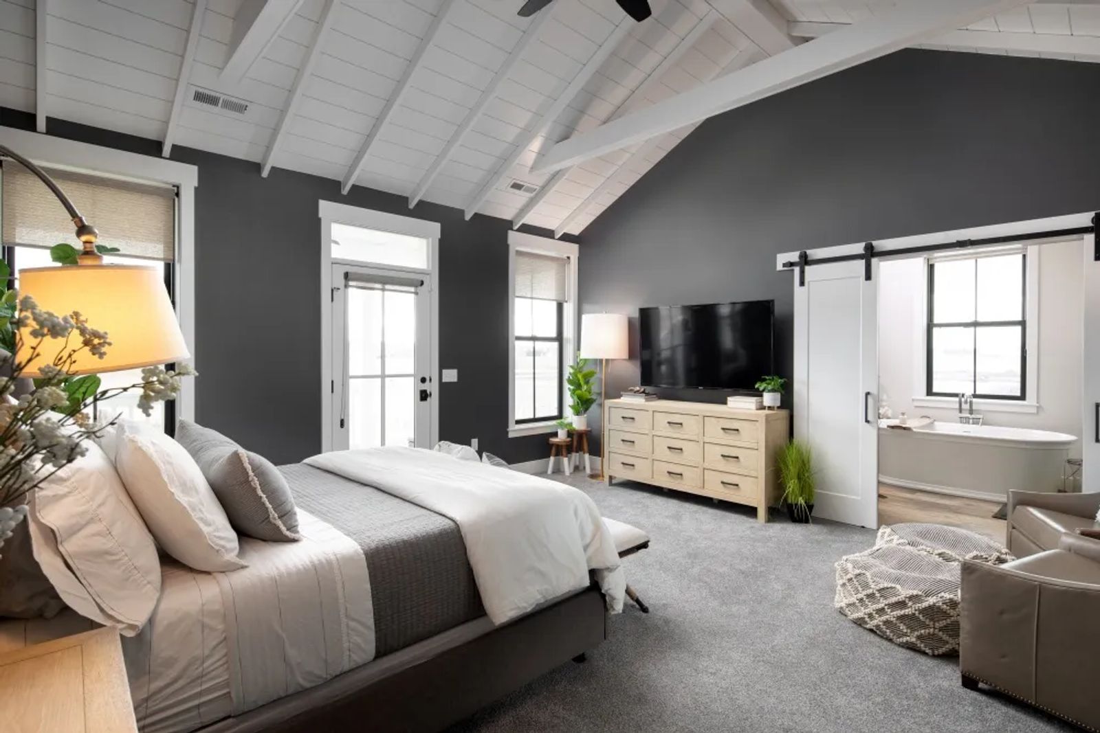
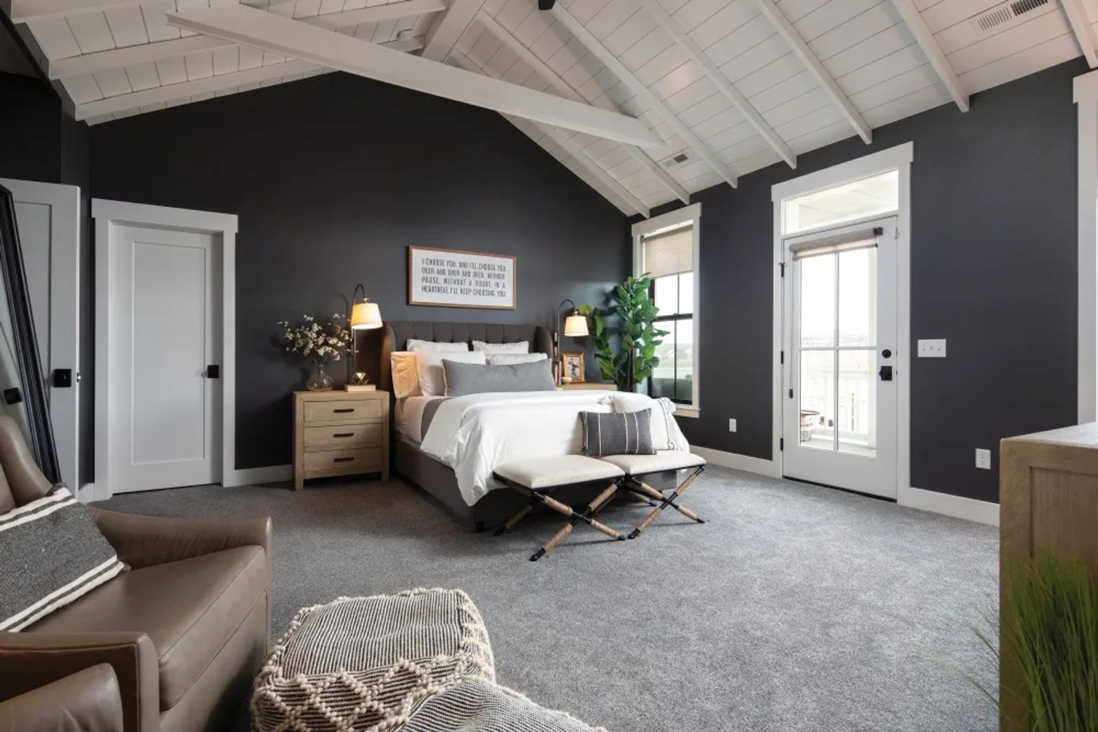
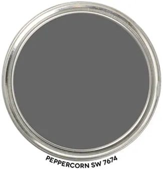
But how about the darker colors for those looking for some extra drama? Not the emotional kind, the decor kind! Go dark. And I mean really dark. Sherwin-Williams Peppercorn and Urbane Bronze are great moody colors. If you're feeling extra bold, paint the walls and the trim the same color.
Sherwin Williams Peppercorn SW 7624 (walls) with Pure White SW 7005 (trim)
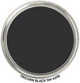
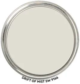
Okay, maybe all dark is too much for you (or even too much work). Pick something that you want to highlight and go bold. In this home, the fireplace is painted entirely in Tricorn Black to bring that dramatic feel while still maintaining a light and airy space overall.
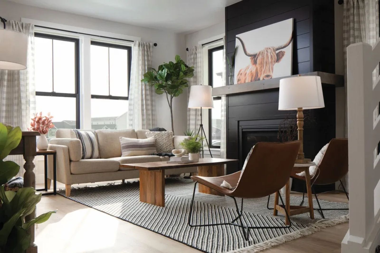
Sherwin Williams Tricorn Black SW 6258 (fireplace) with Drift of Mist SW 9166 (walls)
Maybe you’re a lover of color and all these neutrals I’m throwing at you just feels lifeless. You can have both light and airy and colors. Jewel tones pair nicely with whites and off-whites, creating a bold statement.
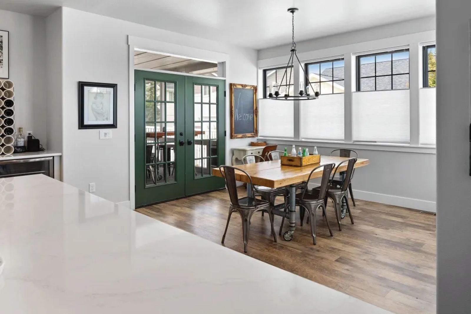
Sherwin Williams Egret White SW 7570 (walls) with Pure White SW 7005 (trim) and Rockwood Dark Green SW 2816 (doors)
After a long and dreary year, I think it's time for a refresh. Changing your paint colors updates the entire feel of your home. So get out your drop cloth and rollers, and let's get painting!
Originally printed in the April 2021 issue of Simply Local Magazine
Never miss an issue, check out SLM's digital editions here!